Using the site ‘www.freelogoservice.co.uk’, we have started making different logos. Due to everyone in our groups initials, MCMV, also being the roman numerals for 1905, we have decided that 1905 studios would be quite fitting. Here are some examples of logos we have already tried on the free logo site.
The above logos are ones that Vicky has tried and shared with the rest of the group. Together we decided that the logo with hands is the logo we prefer because it looks most professional and the font of the writing looks the best.
This logo is also our most preferred because it adds colour and is simple but effective.
Because the groups initials also stand for 1905, we researched what events happened in 1905 and realised it was around the time of the Russian revolution. So from this we decided to use the hammer and sickle logo.
Over the logo we are thinking of putting text that is flickering between 1905 and MCMV. As this will be moving it will become more of an ident, due to this we have decided to use this instead of a logo but we may still put a logo in the corner as we have seen this is other films.
Vicky also completed research into how to do story boards. Since this research, myself and Maddy have been drawing and colouring the story boards for our film opening. Below is Vicky’s research:
‘What is a storyboard?
According to Google a storyboard is a “sequence of drawings, typically with some directions and dialogue, representing the shots planned for a movie or television production.”
I think that the purpose of a storyboard is to make sure that your filming idea can work as you have to go through every single shot that you will use and so it will become evident if one shot is not feasible.
Here are some examples of a storyboard;
Drawn:
Animated:
After we have drawn our storyboard, we will animate one so we know exactly what to do on the days of filming and no problems will arise on that day. Here is a programme that I found the most straight forward and effective that we could use (https://www.storyboardthat.com/storyboard-creator);
I found this programme easy to use and very detailed as you could pick characters according to the time period and even change their details such as hair and eye colour would would be useful for getting it to mock up what our opening 2 minutes may look like.
However, the only slight problem I came across whilst trailing this programme was the fact that the storyboards seem to only be 2D which would be difficult to show the positions of the characters but after a lot of searching I realised you can pivot the character from side to side so this could be a way around the 2D problem.
Also, saving the storyboards is difficult as it seems to only do a certain amount of storyboards a time as these types of websites want you to join the membership and due to the costs this would not be feasible but with 4 of us in our group we could all do a select few storyboard boxes and then eventually sequence it together. Of course we cannot do this until the original draft storyboards are done which will be produced by hand.’
In our group, Vicky did research into logos and idents so that we could start making our own. Without this research, we would not have enough knowledge to start making the logos and idents for our film. Below is Vicky’s research:
‘Idents
I have researched on the search engine, Google; what is an ident? And this is what it told me:
It is a short sequence shown on television between programmes to identify the channel.
This means that it is an aspect of a TV Channel that the audience would recognise to brand the channel. For example, the colour, font, or even individuals in the sequence will be consistently used so when the audience sees it, they will automatically recognise it as that channel.
An example of this is Channel 4, which is a well known channel that shows a variety of shows;
Straight away you probably recognise most of these logos and Indents, which conform together to have the audience knowing what they are watching without even having to pick up the remote and check. An ident of Channel 4 looks like this;
This is where Channel 4 have a random landscape and various objects floating that link to the landscape and they make the number 4, this is universally recognised before a programme will start so the viewers know what channel they are watching, which is great advertisement for the channel because if the ident changed a lot then people would not recognise the channel as quickly and efficiently, and without probably knowing it the audience would know this ident from recall of memory, without even having the think.
Here are some of the idents that Channel 4 has released throughout the past few years, all having the number 4 form on screen in common and also the music is the same, as having both senses (sight and hearing) recognise the ident is even more effective at getting the audience to remember;
Logos
Again I researched “what is a logo?” into Google, and this is what it said;
A symbol or other small design adopted by an organization to identify its products, uniform, vehicles, etc.
This is something that my group and I will definitely have to create as we will not have enough time to create a sequence for the ident as it is only a film and not on a Channel. Here are some logos that my group and I could use as templates for ours;
As you can see these logos are very simple, which I think is key for a logo as they are not too hard to remember and are easily imprinted on the viewers brain and so remembered better. It also seems very common for the logo to have the name of the organisation below it or near it, this is something my group and I will need to take into consideration when creating our logo as a name will have to come with it. It would be a good idea for us to have the name as something that will link to the logo so its even more memorable.’
As the mother in our video is trying to keep her daughter young and innocent so she can protect and prevent her from growing up and leaving her, we will have to make the daughter look younger. We will do this by putting her hair in plain or plaited pigtails tied with ribbons for example, like a little girls hair would be. We have also considered just giving her tight ringlets similar to the curled hair of young girls. We will also give the girl playing the daughter just natural makeup so that it doesn’t look like she is wearing any as a little girl wouldn’t be wearing makeup and makeup would be too much of a grown up thing for the mother to put on her daughter. Another thing we will do to make the person playing the daughter look younger is dressing her in a sweet, childish looking dress. One that is plain and flowing for example, the dress would also resemble the dress a doll would wear as this is fitting with the tea party idea in our opening 2 minutes.
To make the woman, we are using in our video, look older we have decided to use makeup. The makeup will create wrinkles are aged skin. We have practise this effect in the following video:
We will also use costume to show the woman as being older. We will dress her in clothes that are typically seen on middle aged woman, such as long skirts and un-revealing clothes like loose jeans and tops. We will also give her hair that is associated with a middle aged mum. So we have chosen someone with short hair, who is a mum, to play the woman in our film. The mother in the film won’t be wearing anything you expect a my her her age to wear as she has to come across as being normal and that nothing suspicious is going on until you see her daughter tied up.
Maddy was in charge of the casting, here is what she has produced:
For our film we needed two actors. One young actress for the daughter and one older actress for the part of the mother.
It is important that the mother looks old enough. At the time of planning we couldn’t find anyone to play the mother however we later found an actress who was willing to do this so there was no more need to age an actress with makeup like the in the video I had previously made. For the mother we have chosen to use Jane Rhodes as she fits the character we have written because she looks like an innocent mother.
For the role of the daughter we have chosen to use Vicky Bell, She is part of our group so is willing to act in the film as well as direct and provide input whilst filming. Vicky is perfect for the role as she has greatly contributed towards the idea so knows exactly how we want the lines to be delivered and the character to be portrayed.
I think that the actors cast to be in our opening two minutes will help to make our film look as authentic as possible, as both of these cast will be determined to convincingly play their roles.
To make the opening two minutes of our film look as professional and realistic as possible, Vicky spent some time researching the opening titles and credits to films that build tension in the first two minutes, like ours will. Although this example is a documentary, it still builds tension in the same way we expect our film to.
As you can see from this example. Most tension building films don’t include many titles, as too much writing over the opening sequences can ruin the tension they are trying to create in the first two minutes to build up to the film starting. In the example, only 3 titles, including the film title are shown in the opening two minutes. This is because if you are trying to concentrate on what the titles are saying, you are distracted from what is happening and therefore don’t feel the tension that is being created.
From this research we have decided that it would be a good idea in our film to include fewer titles than we were first thinking. Maybe only including the film company names and the film title. If we included all the actors names and the director it would be too much writing and distract the viewer from concentrating on our film opening.
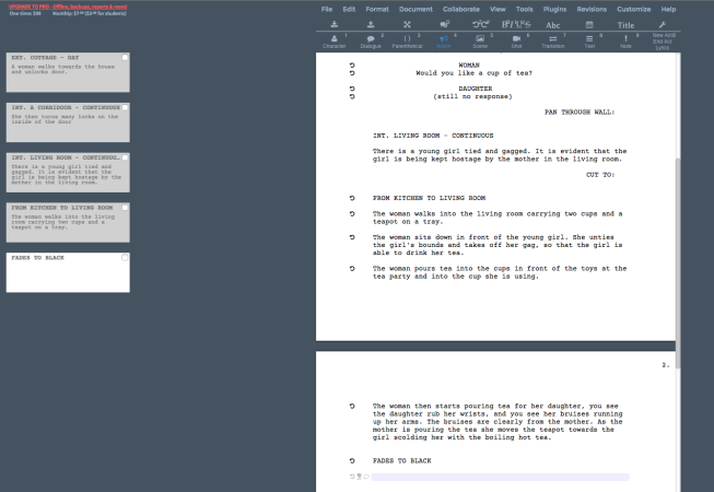
This is the final script for our psychological thriller film opening. I think our script is informative and looks professional, so I am happy with the result. We can now start the storyboarding process and move closer to filming our 2 minute film opening.
We have recently practised a shot that looks through a wine bottle. We think this would look really effective in our final video. We experimented by filming still shots through the bottom of the wine bottle and also putting the camera on a table dolly and filmed shots moving through the bottle. We are thinking of using the bottle for filming the woman making tea and then move the camera on a table dolly away from the bottle as the woman moves or using it with a still camera to film the woman pouring tea on the girl so that it is not perfectly clear what is happening but it is implied what is happening. This would create a really good eerie effect will add to our genre of psychological thriller.
Bellow are the screenshots of our script so far and how it will progress to the stage where we have completed our final script. After this post, I will post our final script but this shows the drafting process. We have tried to make the script look as professional as possible by using the different features on WriterDuet.


 It is important that the mother looks old enough. At the time of planning we couldn’t find anyone to play the mother however we later found an actress who was willing to do this so there was no more need to age an actress with makeup like the in the video I had previously made. For the mother we have chosen to use Jane Rhodes as she fits the character we have written because she looks like an innocent mother.